Where to begin
Most people stand in front of a floral painting and respond immediately to colour. That first reaction is honest and worth keeping. But if you slow down and look again, you will find that a good floral painting is a set of deliberate decisions working together: where the painter placed things, how light and shadow are implied through colour, and what was left unpainted. Learning to notice those decisions does not make looking more clinical. It makes it richer.
This guide works through three tools — composition, colour temperature and negative space — and uses the acrylic floral works of Singaporean painter JJ Tan to illustrate each one. His paintings are a useful case study because the structural choices are visible rather than hidden. The saturated colour and bold outlines do not obscure the underlying logic; they make it easier to trace.
Composition: where things are placed and why
Composition is the arrangement of elements within the picture plane. In floral painting this means deciding how many blooms appear, how large they are relative to the canvas, whether they are centred or offset, and whether the eye is guided in a particular direction. A painter working with lilies or hibiscus might fill almost the entire canvas with a single large form, leaving very little background visible. That is an active compositional choice, not an absence of one. It creates a sense of closeness, as though the viewer has moved very near to the subject.
In Tan's work, large petal forms frequently press towards the edges of the canvas. This pulls the viewer into the picture rather than asking them to observe from a distance. When you look at a floral painting, ask yourself whether the bloom is contained comfortably within the frame or whether it seems to extend beyond it. That single question will tell you a great deal about the emotional register the painter was working towards. Containment tends to feel decorative and ordered; pressure against the edges tends to feel immediate and physical.
Colour temperature: warm against cool
Colour temperature describes whether a colour leans warm — towards red, orange and yellow — or cool — towards blue, green and violet. In any painting, the relationship between warm and cool areas does a large share of the work that the eye reads as light and shadow. A warm yellow petal placed against a cool dark ground will appear to glow, because the eye is trained by everyday experience to associate warmth with light and coolness with shade.
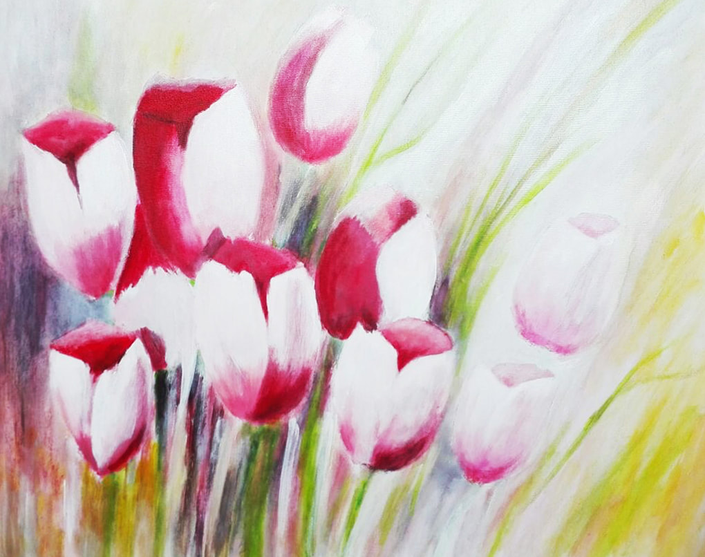
Tan's palette makes this principle unusually legible. Reds and pinks sit against deep greens; yellow petals emerge from blue or near-black grounds. These are not simply colour choices made for decorative effect. They are the mechanism by which a flat acrylic surface produces the sensation of a petal catching light. When you stand in front of any floral painting, try to identify the warmest area and the coolest area. The contrast between them is almost always where the painter wanted your attention to rest.
It is also worth noticing whether warm and cool colours are used at full saturation or whether they are mixed closer to neutral. High saturation throughout a canvas, as is characteristic of Tan's work, maintains the intensity of that warm-cool contrast across the whole picture. Lower saturation, as you find in many botanical or naturalist traditions, softens the contrast and produces a different kind of light — quieter and more diffuse. Neither approach is superior; they are different instruments.
Negative space: what is not painted
Negative space is the area around and between the painted subject. In floral work it might be background, a gap between stems, or a passage of unmarked canvas. Beginners tend to think of negative space as nothing — the absence of content. Experienced painters treat it as a shape in its own right that must be designed as carefully as any petal or leaf.
When large forms fill the canvas, as they often do in Tan's paintings, the negative space is reduced to narrow passages. These passages carry significant weight precisely because they are scarce. A thin sliver of dark ground between two petals can provide the visual rest that lets the eye move from one warm area to the next without fatigue. When you look at a densely painted floral canvas, trace the dark or empty areas as shapes. You will often find that they form a coherent rhythm that holds the composition together from behind.
In paintings where the negative space is more generous, it takes on a different role. A bloom isolated in a large field of neutral or dark colour draws attention to its own contours and invites a slower reading of form. This approach is common in Japanese ink painting traditions and continues to influence many contemporary painters working in other media. The principle is the same whether the ground is ink on paper or acrylic on canvas: the empty area is never passive.
Putting the three tools together
Composition, colour temperature and negative space are not separate categories that you apply one at a time. They act together in every area of a painting simultaneously. A large bloom pressing to the upper edge of the canvas (composition) with warm petals against a cool ground (colour temperature) and a thin strip of dark background visible between leaves (negative space) produces a specific cumulative effect. Changing any one of those three elements would change the reading of the whole.
The most useful habit when standing in front of a floral painting is to look once quickly and then look again slowly. The first look gives you the immediate impression the painter intended. The second lets you begin to ask why that impression was produced and which decisions created it. Over time, this double-look becomes automatic. You start to see the structure of a painting at the same moment as you respond to its surface, and both experiences become more complete.
Tan's acrylic floral works — orchids, hibiscus, lilies and invented garden forms — offer a clear set of examples because the structural choices are made at high contrast and large scale. Visit the Works archive to see the floral studies together and practise applying these three lenses. The aim is not analysis for its own sake but a fuller, more sustained engagement with paintings that reward the time you give them.